Back in 90s, an infinite number of small text lines bragged around and simple Times New Roman or Arial texts filled up the webpage. Today, just adding blobs of text won’t do anymore.
In fact, unlike the past century, owning a website is no more a costly affair. With the evolving trends and competitive business arena, it is vital for a cutting-edge UI/UX design team to understand the minds of people.
Cut-short; using the right combination of technology and art, that’s what UI/UX design is all about in 2018.
Let us see what is currently trending in this domain.
Mid- year Review: Mobile UI/UX Trends 2018
1. Full-screen, HD Experiences
This is the new age of Samsung Galaxy S8 and iPhone X.
The trend that has caught user attention is frameless design. There is more screen space available for user. This makes them expect full-screen experiences. The main reason behind this expectation is that you have the ability to take elements and create stunning user experience. With this, you can sort out any unwanted distractions. This would also improve the focus on the task in-hand. Hence people prefer it much.
2. HD Images, videos
Quality matters. The pixelated images will no more appeal to the people. Users expect HD images which are clear and flawless.
Research shows that the human attention period has drastically reduced from 12 to eight seconds. Hence HD Video-based UI is expected by most of the users. Not only this, Hubspot stated that 78% people do watch online videos on a weekly basis. 55% of the videos is habitual to watching videos per day. Hence adding HD video is the top-notch trend of the day!
3. Same video experience in every orientation
It is quite challenging to design for device orientation. The UI/UX designer requires careful thinking and analysis before designing. They have to think how they can optimize the video space, compress it and analyze how they can make the video look better in every orientation. Be it portrait or landscape, the video quality must not deter. It is a well-known fact that users deter from rotating the device while discovering the complete feature of the app. Either portrait or landscape, the video must be compact when you rotate or turn away the device.
4. Live/360 format for real-time experience
If you have a splendid video with an applause deserving content, then Live/360 format video would be the best match. The Live/360 format will not alter the effects of a fluttering content. But if the content is really promising, then 360 format is a must go. This can very well opt for customer success stories of your business.
5. Vibrant colors
“Color is a power which directly influences the soul” - Wassily Kandinsky.
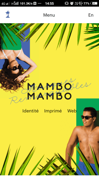
A colorful webpage is always a user and UI/UX team favorite. No one is fond of a dud looking webpage that is not linking anywhere with your brain. Bright, striking colors are the trend of the day. Mambo Mambo's aesthetic website is one great example.
Most people prefer simple color combinations with two or more colors, according to study conducted by the University of Toronto. Also, the monochrome colors were the choice of many users owing to its eye-pleasing effects.
Empathetic Design User Journey, Simplified
Linear User Flow + Progressive Disclosure = Superior UX
The key element behind simplifying the user experience is to research, detect and share your work. Before you start on with your UI customer journey simplification process, do a complete research on who your customers are and what they are upto. This will help you keep up with the market trends. Then detect any possible errors or bugs. After this, present the impeccable work to your customer.
Emoticons and Animations
Statistics prove that 74 percent of people in the U.S. are regular users of stickers, emoticons or emojis in their online communication. On an average, a user sends over 96 emojis or stickers daily. Isn’t that cool? It would be great if we can include them in UI design since customers can relate easily to them.
The ultimate aim behind emoticons and animations is to provide the user with a pleasant, welcoming feel. Also make sure that the files are compressed properly before you ping it up on your website.
Natural Interactions With Apps
The main motto behind Apps is to make the customer experience more reliable. Hence it would be a welcoming approach if we can make the UI/UX design more intractable and user-friendly. The app must not seem alien to the user.
Mimic Emotions In UI Feedback
No one needs an automated, robotic feedback. It would be cool if user emotions are mimicked and transferred while dealing with UI Feedback.
In-app Gestures Paired With Animation
Small things are what counts in a UI/UX design. Those taps to twists to tilts, In-app Gestures enhance the user experience.
If UI/UX teams are able to pair up their animation skills with this, then there will be a dramatic improvement in the user experience.
Cashless Payments
Including mobile payment options with credit/debit card will make the process easier for the user. They need not look up where to offer the cash from their wallet anywhere, but your website or mobile.
Content-centered Design With Minimum Visual Clutter
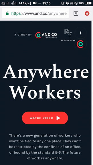
Courtsey: www.and.co
The content and the design of the website must have strings attached to each other. It must have a rhythmic flow. The UI/UX Design teams must coordinate with the content creation team well enough to produce a masterpiece of their website.
As Steve jobs believed, simplification is the ultimate sophistication. Keep the visuals simple yet effective. This would create an everlasting impact on your website.
Complex Reduction: This is a new trend that a great UI/UX design company would center their approach on hereafter. The secret sauce behind this is just these 3 rules that have to be followed:
- Bigger, bolder headlines that create that solid impression.
- More simple and universal icons
- Color extraction
Follow these 3 key rules to leave your users in awe.
1. Smart content integrations
Content is no more an afterthought for a UI/UX design company. It is more like a song and the tune. Both are inevitable to create that cult music. The UI/UX teams have to take a note of this and integrate with smart contents.
2. Clear Visual Hierarchy
Nobody wants to get muddled with your UI/UX design. It has to speak what it is ought to speak. UI/UX design teams must be able to give a clear picture of what they are trying to say. Define the content through design. Not the other way around.
3. Long form content
There is one thing common between Pitchfork and New York times UI/UX design. It’s their ability to handle long-form contents as simple and user effective as possible. Long form contents can be merged with a great UI design. A UI/UX design company will know this factor and work on this more.
Advanced Personalization
Accenture noted that 33% of customers abandon business relationships because there is no personalization. Customers must be made to feel at home when they visit your website. A great UI/UX design company can make this tedious step possible.
- Provide Content Based on User Location: A user sitting with a coffee in Japan would not be interested in what your business is offering at India. The content has to be prepared remembering in minds with who, what and where their customers are from. This will make the process less sophisticated for the user as well as the businesses.
- Tailored User Interface: The user interface has to ready-made and stitched, keeping in mind of the user. The process has to be flawless from the first welcome to the last thank you.
- Chatbots As Personal Assistants: Voice assistants such as Siri and Alexa has revolutionized customer experience. Wouldn't it be great if you can include a voice assistant that would welcome the customer to your webpage and guide them enthusiastically? Choose a UI/UX design company that can work wonders with this ultimate customer relationship enhancement feature to your website.
“People ignore design that ignores people” - Frank Chimoro, designer
For a UI/UX design team, the user must be the first priority. It is expected by them to keep in mind for who they are toiling hard. A good UI/UX designer would know that it is the customer who their ultimate efforts would reach to. A designer must think twice before making a decision. For a great UI/UX design, the team has to update themselves with the current trend. This would help them carve a niche for themselves.
Conclusion
Thus we have seen what are all the current trends that outshine the UI/UX design industry. Make sure to choose a good UI/UX design company, with all these points in your mind. The trends keep evolving. So keep up with the pace!


