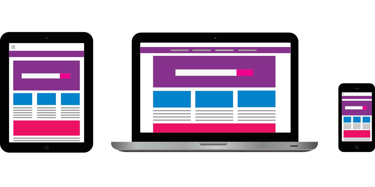
Mobile-revolution has taken the world by storm. Everything that was once only desktop-friendly, can now be easily accessed on smartphones - all thanks to the existence of the responsive coding. If your favorite website runs just as smooth on your mobile phone or tablet than it does on your laptop, then it is designed to be immaculately responsive.
A responsive website, as the theory states, ‘responds’ to the environment it is set in, eliminating any apparent malfunctioning that comes with the change in the handling device. It ensures an ultimate user-experience regardless of the interface- device, browser, screen size, resolution or orientation -they are using.
But there’s a lot more to the responsive design that screen-size adjustments and resolutions. We’ll get to that, first let’s look through the idea behind this awesome design!
The ‘Tale’ behind Responsive Web Design (RWD)
‘Responsive web design’ is a brainchild of Ethan Marcotte, a famous web designer. He was credited with the term following his publication ‘A List Apart’ in the year 2010. The article actively discussed how building separate sites for every device, browser, screen size and resolution was not a sustainable option. The same year, Ethan came up with a more fluid and adaptable option- a responsive option- that would fit every screen possible.
Before the responsive evolution (even before the birth of iPhone), there were different development methodologies and concepts for every device. While it saved a lot of development costs, developers and users alike were faced with a number of limitations including hiked maintenance costs, decrease in SEO ranking owing to different devices, the list goes on.
Now when we know the history of responsive design, let’s know what all goes in creating a responsive website.
Related Articles: |
What goes into building Responsive websites?
The responsive design consists of three important pillars: Flexible grids and layouts, images and media queries (breakpoints).
A CSS-based flexible grid layout utilizes relative sizing that enables the required content-fit for every device. Flexible media allows users to easily adapt images and media in sync with the device in hand. This step usually utilizes scaling- the web browser is able to shrink or expand the image (which is generally kept at a 100%)- or, by CSS overflow property, which specifies what will happen to the content if it flows past the element’s box. Media queries, on the other hand, are used to apply different styles corresponding to the capabilities of the device. The website automatically detects the size, orientation, and every required feature and adjusts to it- all due to media queries.
All these backend features are focused towards one thing- seamless user experience. If a person switches from their smartphone to laptop to tablet, the flow should be dynamic. That’s what a responsive design does.
The Argument
In the beginning of the article, we mentioned about the apparent mobile revolution, which, needless to say, hyped the responsive design market. But, can we say that we are headed towards a ‘responsive’ world? The answer would be yes. Well, that’s considering the new age of web design and development. We really can’t say anything about AI and robotics, for now.
Seeing how we are faced with technology breakthrough almost every year, the future-ready responsive design is legit going to save A LOT of our (and developer’s) efforts in the coming time. Plus the growing rage of smartphones. Studies state that by 2019 more than half of the world be using smartphones, like 5 billion out of the 7.6 billion population.
Taken, responsive design is NOT the ONLY answer to the growing technological advancements. But, it’s definitely one of the most feasible options, if we consider how every brand is considering making their website responsive. For now, we can stay back and witness how everything unfolds.


