The other day, I was using a new platform for creating infographics. I had used similar tools before, so I thought it would be easy to use this one, too.
However, I soon noticed that it was difficult to navigate.
I wanted to adjust the size of my canvas. Usually, it can be found somewhere in the settings, perhaps on the right side of the canvas.
The settings icon is always this little cogwheel, right?
It was nowhere to be found. In the end I was able to find a place where to modify the size, but it had taken me several moments more than I wanted.
Next, I wanted to lock one element in place while moving other elements in front of it.
Once the larger element was locked, I couldn’t move the smaller elements.

I had to remove the large element, put it aside, place the smaller icons how I wanted them, and then add the bigger one behind them. Only to notice that the other elements were still a bit off.
I’m sure you can sense my frustration.
Why was this platform so difficult to use?
Probably because it was not made by a competent user experience designer.
Definition and Principles of Experience Design
Experience design is exactly what it sounds like. It is designing smooth and functional experiences for people, and leaving a positive impression.
Basically, design thinking intends to produce experiences that are the opposite of what happened to me in the previous scenario.
The user’s feelings and needs are in the center of experience design. If someone is going to have an experience with your brand, you need to make sure it is a good one.
The experience design mindset can be applied to any context. Whether you are making an app, creating a new business concept, or building a feedback form, the experience of the user is important.
This blog will shed light on the principles of human centered design and provide tips for a design process.
We focus on software and digital design, but feel free to apply the knowledge to any other context.
Here are some key principles that experience designers follow. When reading through the principles, you can contrast them with the example I provided earlier.
-
Put the User and their Emotions First
As a software developer, you might feel intrigued to design something grand and crazy.
But are your plans aligned with what the end-user would want and need?
If not, it’s time to reconsider. If your product does not fulfill expectations and is difficult to use, you won’t be able to grow your business.
-
Solve Problems, Do Not Create Them
Have you ever been in a situation where you are trying to use a new tool, but it just doesn’t work like you wanted to? It feels like using this tool makes your life harder rather than easier.
That’s poor experience design.
Your company should be solving problems with its services, not creating them.
-
Be Invisible
When a software is well-designed, the user does not even notice it.
Granted, sometimes you might experience these moments of “wow, that’s really smart design!”.
It is not a bad thing, but generally, people don’t notice when the design is good. It just works seamlessly.

-
Don’t Try To Reinvent The Wheel
It is true that some of the most successful businesses have come up with a unique solution to an everyday problem.
You, too, might have ambitious goals to develop new processes for existing concepts. It’s a noble objective, but be careful.
Unless your product is completely unprecedented, the chances are that people are used to a certain way of thinking and doing.
Apps have been around for so long that many practices have become intuitive. If you do something differently, you are creating problems.
So, it’s better to keep it simple and not try to change how people use everyday products. Your customer’s demands keep on increasing with every passing day. You can always add something new, but not change what is already working well.
-
Keep Accessibility in Mind
Accessibility is crucial for customer experience.
If you are non-disabled, you might not even realize how much certain factors play into an accessible experience.
Keep in mind that your target audience might have challenges with hearing or seeing, to name a couple examples. This places special requirements for your platform.
Accessibility is not just about people with special needs. Visual design, such as colors and fonts, play a great role for even non-disabled customers.
When designing for accessibility, take into account visual elements like colors, fonts, and icons. Free icons, like those offered by Flaticon, can be excellent resources for graphic design and help make your platform accessible to everyone.
Even if a certain color combination looks cool to you, it might not be the best choice in terms of readability. So, aligning should be cool colors combined with the right text structure, and fun font
-
Take the Whole User Journey into Consideration
Experience design is not just about your product. It’s so much more!
It entails things like
- How does the customer feel when seeing your product?
- Is the buying process smooth?
- Can the users access support easily?
- Are the users able to do what they want to do?
- How do you communicate with users and how they feel about it?
- Are the features intuitive?
Basically, even if your SaaS product is perfect, the user experience might not be the greatest unless you adopt a design thinking approach.
You must consider every touch point in the user journey.
Steps to Take in Experience Design Process
How to design experiences?
It is best to mix
Here are some practical tips on how to deliver the best user experience.

-
Analyze Your Users
Understanding people is the first step.
Research your customers, their pain points, and what they want.
- Why is someone using this platform?
- What are they looking to accomplish with the tool?
- What are the most important features?
- In what kind of situations are they likely to use the platform and what kind of requirements do those situations set for the product?
- What will make them happy and what will frustrate them about this product?
Once you have that figured out, you can start designing your new product.
-
Follow the Users’ Behavior
When you have your product in the market, follow its success. Gather insights during the testing phase of your product.
Are people doing what you hoped they would do? Are users behaving the way you expected? Data like this is important, as it tells you how well your product is performing.
Have people continuously asked you how to do something? If so, the design might have room for improvement. Receiving the same question over and over is a sign that something is not working the way your customers would like it to work.
Use heatmaps, customer experience management and other analysis tools to find out how users behave.
-
Collect Feedback
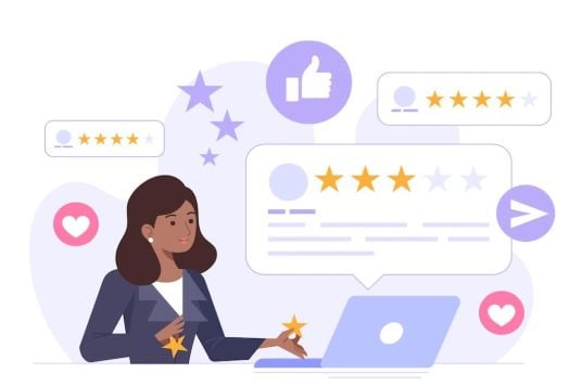
One way to find out what your customers think about their experience is to collect feedback.
When honoring the web design approach, you should be asking users about how they feel.
Great questionnaire types for finding out how your customers feel are Net Promoter Score, Customer Effort Score, or perhaps just a simple smiley face rating.
While important, you can’t rely on feedback solely. You need to also follow how people use the product. One might give good feedback today and face an unexpected challenge tomorrow.
-
Test Variations
Don’t be shy: test different design decisions!
Customers’ expectations change all the time, and your product has to follow. There’s no harm trying out different solutions while you are still at the testing phase.
Conclusion
Experience design is everywhere.
I have even been using design thinking when writing this article.
I have made a guess about who is reading this article and why. I have tried to answer that intent and provide the most accurate information.
While doing so, I have paid attention to the word choices and sentence structure. Hopefully I have been able to make mindful decisions and satisfy the need that you had when starting to read this article.
Hopefully I was able to answer more questions than raise new ones.
If so, we could consider this post a successful design!
Sometimes people fall in the trap of designing something that they think is cool, not what the user really needs.
I have for sure been guilty of that.
Innovative solutions are good when they add something new – not change something that was already working.



.png)
